
The original badge and what it said about the car
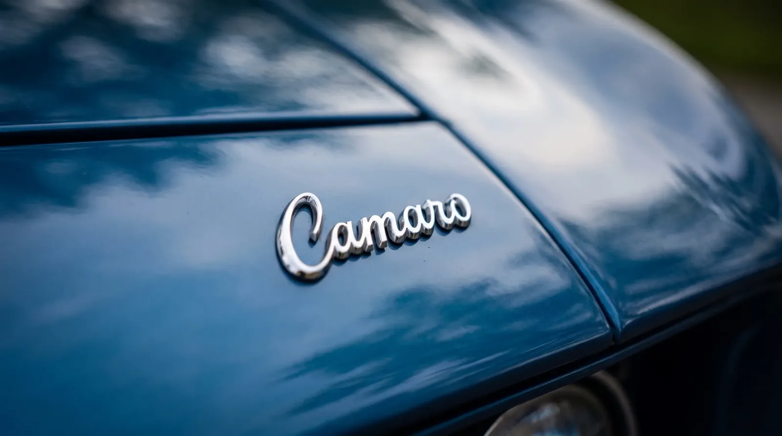
The camaro logo that appeared on the first production cars in 1967 was a straightforward piece of automotive graphic design from a period when automotive graphic design was expected to communicate power and precision above all else. The name Camaro appeared in block lettering on the front fender, typically in chrome or bright metal finish depending on the trim level. The typeface was custom-developed for the nameplate and carried a forward-leaning quality that the design team intended to suggest motion even on a parked car.
Chevrolet's broader identity at this period used the bowtie logo, which had appeared on Chevrolet vehicles since 1913, according to the official record [VERIFY bowtie origin date]. The Camaro used the bowtie in combination with Camaro-specific lettering rather than replacing one with the other. This two-part identity system, where the corporate mark and the model identity coexisted, was standard practice at GM across its lines and distinguished American automotive branding from European approaches that often subsumed model identity under a stronger house mark.
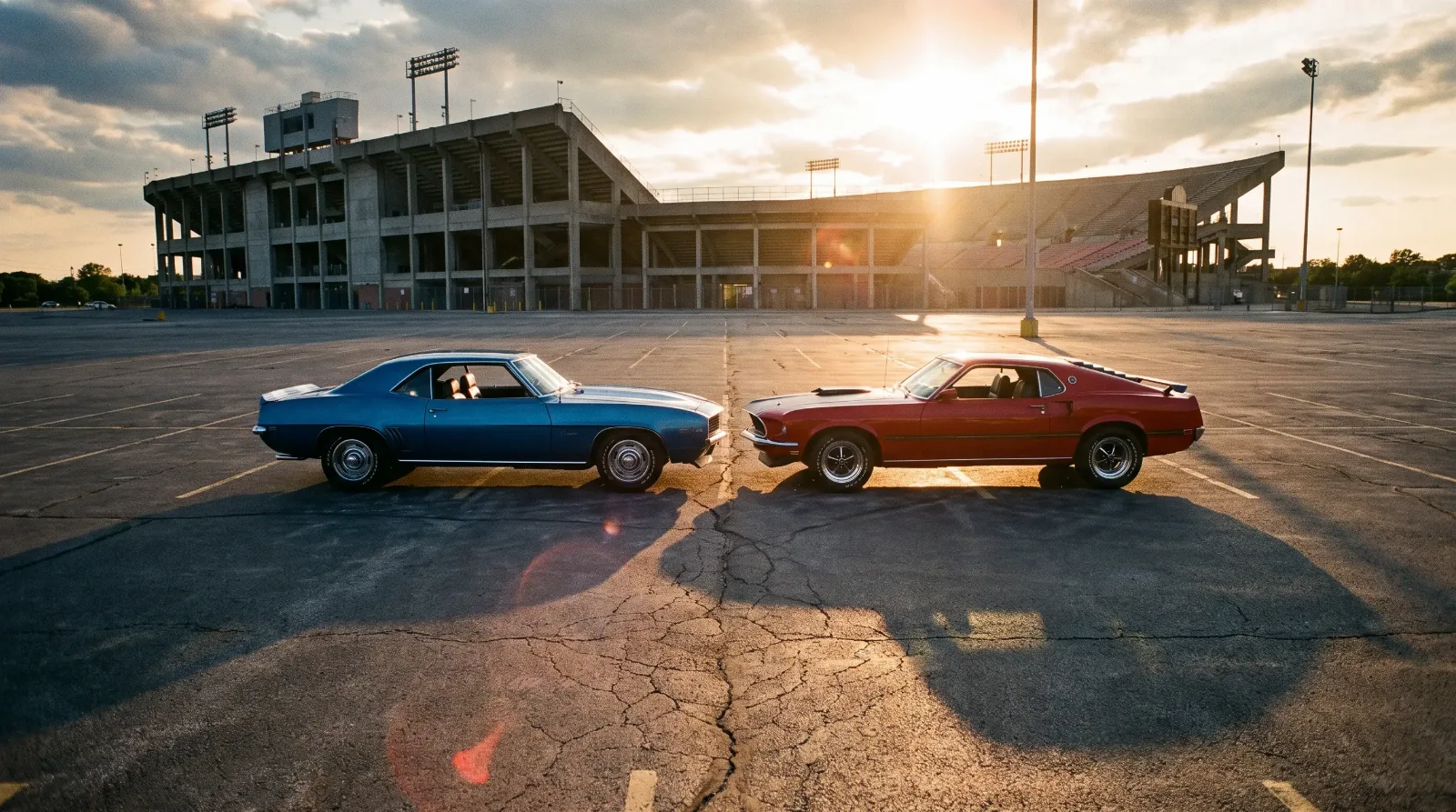
For the complete story of where the Camaro fits within Chevrolet's history, the Chevrolet Camaro history covers the model's full arc from development to the sixth generation.
How trim levels changed what you saw on the car
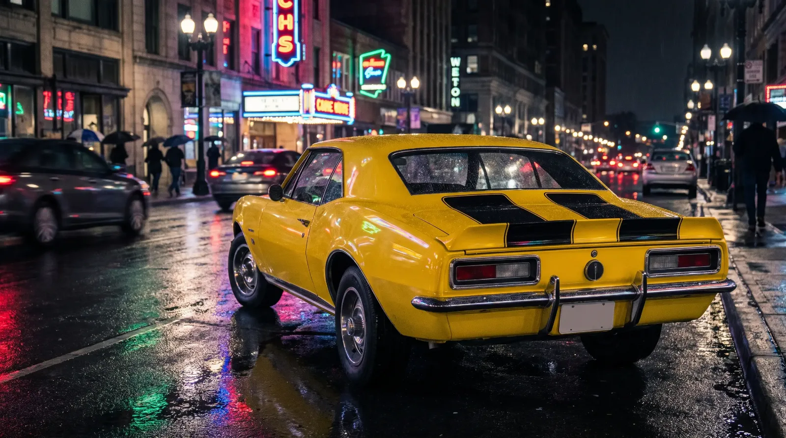
In the first-generation Camaro (1967-1969), the badge presentation varied significantly based on the options ordered. A base Camaro wore relatively restrained badging. An SS model added Super Sport call-outs on the grille and rear panel. An RS brought hidden headlights and specific trim treatment that altered the front fascia's visual identity. A Z/28 received Z/28 identification on the front fenders in a script that was distinct from the standard Camaro lettering.
This badge architecture was not arbitrary decoration. Each marking communicated a specific configuration to someone who knew the system. An SS badge meant a specific engine and equipment package. The Z/28 designation indicated the Trans-Am racing package. This language of badges was common across American performance cars of the period, but the Camaro's execution was particularly layered because of how many legitimate configurations existed simultaneously.
The RS/SS combination, where both packages appeared on the same car, required a specific badge arrangement that has become a reference point for restoration judges. The correct application of letters and emblems on a first-generation Camaro is a subject detailed enough to fill dedicated chapters in restoration manuals, and errors are identified quickly at shows.
"The badge arrangement on a first-gen Camaro is essentially a data label for enthusiasts. Anyone who knows the system can read the configuration of a car from across a parking lot without opening the hood."
-- Tom Ramirez
Second and third generation changes
The second-generation Camaro (1970-1981) brought a redesigned lettering treatment that reflected the design language of the new body. The block letters gave way to a slightly more refined treatment, and the badge placement shifted as the body panels changed. The Z/28 designation continued, as did SS badging through 1972 when the Super Sport package was discontinued mid-generation [VERIFY SS discontinuation date within second generation].
The third generation (1982-1992) marked the most significant departure from the original badge language. The car had changed substantially in character, moving from body-on-frame construction to a unibody platform and adopting more aerodynamic bodywork. The lettering updated to reflect this. The Z/28 continued as a designation, and the IROC-Z appeared as a name derived from the International Race of Champions series that Camaro supplied as the spec vehicle [VERIFY IROC-Z introduction year]. The IROC name gave the third-generation car a specific identity that neither the first nor second generations had carried through competition branding.
Fourth generation through the nameplate's current status
The fourth-generation Camaro (1993-2002) returned to a more traditionally muscular typeface treatment after the third generation's more angular lettering. The SS designation returned in 1996 as a dealer-level package before becoming a factory option, and the badge arrangements updated accordingly. The Z/28 retained its position as the performance leader until the car's discontinuation after the 2002 model year.
When the fifth generation launched for 2010, Chevrolet made a deliberate decision to reference the first-generation visual language. The badge treatment used a retro-influenced lettering style that called back to the 1960s originals without directly copying them. The bowtie on the front end was updated but remained the anchor of the front fascia identity, and the Camaro lettering appeared on the trunk lid in a form that balanced period reference with contemporary cleanliness.
The sixth generation (2016-2024) refined this further, giving the car a more aggressive face and updating badge placement. By the end of the sixth generation, the Camaro's visual identity had completed a full arc: the badges of the 2024 car were recognizably descended from the 1967 originals while being clearly contemporary in execution.
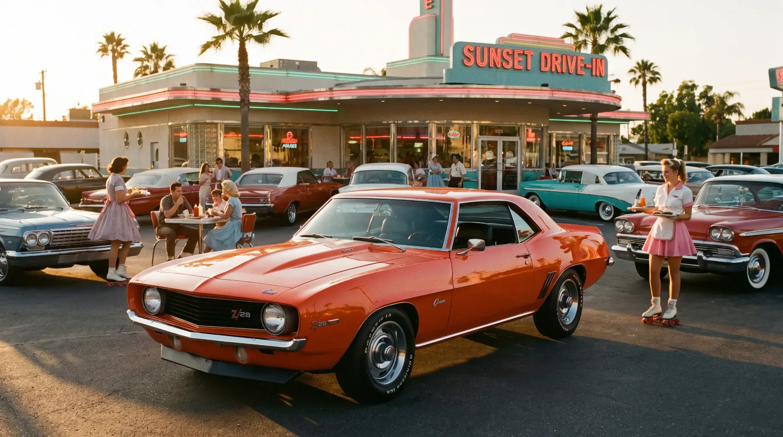
Understanding what the name behind the badge actually means is the next piece in this series. Read about what the word Camaro actually means, which turns out to be a more contested question than most people expect. And for more visual history of the Camaro's cultural presence, the Camaro in pop culture covers its film, television, and media appearances.
Sources and notes
Production figures, engine specifications, codes, and dates in this article are cross-referenced from established Camaro references, period documentation, and owner registries. Where sources differ, the most commonly cited value is used. Cost figures are indicative and vary by supplier, region, and condition.