
Color as Language: How the C2 Corvette Spoke Through Its Palette
There is a particular kind of meaning that collects around color over time — not the meaning a manufacturer intends when it names a shade, but the meaning that accretes decade by decade as cars survive, photographs fade, and enthusiasts argue. The C2 Corvette Sting Ray, produced between 1963 and 1967, offers one of the most instructive case studies in American automotive color history. Across just five model years, its factory palette shifted from restrained earth tones and conservative blues to vivid, almost confrontational hues — a transformation that mirrors the broader cultural arc of the 1960s more precisely than any marketing document ever could.
To study C2 Corvette colors is to study intention versus outcome. General Motors' color teams were designing for the tastes of a specific moment, working within paint chemistry and production constraints. What they could not have known is that their choices would become a kind of shorthand — that decades later, a photograph of a Nassau Blue 1965 coupe or a Sunfire Yellow 1967 convertible would carry an almost novelistic charge. The Corvette is the longest-running American sports car, and the C2 generation remains the era most deeply defined by what it looked like.
1963–1964: The Restrained Opening
The 1963 Sting Ray arrived wearing a palette that was, by later standards, almost conservative. Tuxedo Black and Ermine White anchored the lineup at its extremes — as they would for the entire C2 run — while Riverside Red provided the expected sporting option. But the colors that say most about 1963's design philosophy are the ones less often remembered: Saddle Tan, a warm earthy tone that gestured toward continental sportiness, Daytona Blue and Silver Blue for buyers who wanted something between black and vivid, and Milano Maroon, a deep burgundy that reads today as restrained and almost formal. Milano Maroon is a color that suited a car still proving itself — elegant rather than aggressive, with the kind of depth that photographs as almost brown in poor light.
The 1963 split-window coupe is the most visually radical Corvette body ever produced, and yet it launched in a palette that didn't match its ambition. Period accounts suggest this was deliberate — GM's color teams wanted the car's shape to do the talking, with paint selections that wouldn't overwhelm the form.
The 1964 palette made one significant editorial statement: Milano Maroon was dropped, and Satin Silver arrived. This single substitution is worth dwelling on. The silver moved the car's color story away from warmth and earth and toward something more modernist and cool — a direction that would only intensify as the decade progressed.
1965: The Palette Finds Its Voice
If there is a single year that defines the C2 color story in cultural memory, it may be 1965. This was the year Nassau Blue entered the lineup — and the year that the Corvette's color identity began to feel genuinely distinct from the rest of the GM stable.
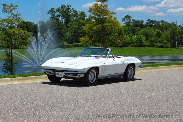
Nassau Blue is a vivid, saturated mid-blue that sits in a register unlike any of the earlier C2 blues. Where Daytona Blue and Silver Blue both read as relatively conservative — plausibly at home on a Buick or Chevy — Nassau Blue was specific. It has the quality of a color that knows where it is. On the long hood of a 1965 Sting Ray, Nassau Blue reads as confident, almost celebratory, and it photographs beautifully in the kind of high-contrast outdoor light that 1960s car photographers favored. The color would carry over into 1966, and its two-year run is partly why it has become so strongly associated with the mid-C2 era.
The 1965 palette also introduced Glen Green — a muted, slightly complex green that would eventually give way to more dramatic green options — and Milano Red, which is worth distinguishing from the earlier Riverside Red. Milano Red reads as slightly darker and richer, with more depth than Riverside's brighter, more primary-red character. The two colors are sometimes confused in period photographs, and sorting them out is part of what makes C2 color documentation both challenging and absorbing.
"The colors that achieve long afterlives are the ones that encoded their moment without trying to — Nassau Blue wasn't designed to feel like 1965, but it does, absolutely, the way a particular song can lock you into a season you weren't even alive for."
— Sarah Whitfield
1966–1967: The Palette Declares Itself
The 1966 color lineup is where the C2 palette fully commits to its era. Gone are Daytona Blue and the muted intermediate options; in their place arrived Mosport Green, Laguna Blue, Trophy Blue, and one of the most culturally resonant C2 colors: Marlboro Maroon.
Marlboro Maroon occupies a different emotional register than Milano Maroon from 1963. Where Milano was restrained and a little formal, Marlboro is vivid — almost wine-red in some lights, with a richness that reads as dramatic. The juxtaposition of these two maroons across the C2 run is an object lesson in how a shared color family can communicate very different things depending on saturation and context. Silver Pearl also arrived in 1966, a more lustrous silver than 1964's Satin Silver, and the overall impression of the palette is of a car that had found its confidence.
Then came 1967. The final C2 model year is widely considered by many observers to be the generation at its peak, and the color lineup reflects that status. Lynndale Blue and Elkhart Blue replaced the earlier blues, Goodwood Green stepped in for Mosport, and Rally Red continued the tradition of a vivid red option. But the color that defines 1967 — the one that feels like a statement about where American automotive culture was heading — is Sunfire Yellow.
Sunfire Yellow was new for 1967, and its arrival is almost impossible to read as anything other than a signal. Yellow had no precedent in the C2 palette; it was a genuinely new register, and on a Corvette it announced something. The muscle car era was accelerating; the visual vocabulary of performance was shifting toward high-visibility, declarative colors. Sunfire Yellow was not subtle. It was not continental. It was American and loud and it belonged to its moment.
Year-by-Year Color Reference
| Year | Notable Colors | Notes |
|---|---|---|
| 1963 | Milano Maroon, Daytona Blue, Silver Blue, Saddle Tan, Riverside Red, Ermine White, Tuxedo Black | Most conservative palette of the C2 run; Milano Maroon (deep burgundy) signals a restrained, European-leaning aesthetic |
| 1964 | Satin Silver (new), Silver Blue, Daytona Blue, Saddle Tan, Riverside Red, Ermine White, Tuxedo Black | Milano Maroon dropped; Satin Silver introduces a modernist, cooler direction; palette begins its shift away from earth tones |
| 1965 | Nassau Blue (new), Glen Green (new), Milano Red (new), Silver Blue, Riverside Red, Ermine White, Tuxedo Black | Nassau Blue is the standout — vivid, saturated, culturally enduring; Milano Red distinguishes itself from Riverside with greater depth |
| 1966 | Marlboro Maroon (new), Mosport Green (new), Laguna Blue (new), Trophy Blue (new), Nassau Blue (carried), Silver Pearl (new), Ermine White, Tuxedo Black | Most expansive and dramatic palette of the generation; Marlboro Maroon marks a shift from earlier maroon's restraint toward something more vivid |
| 1967 | Sunfire Yellow (new), Lynndale Blue (new), Elkhart Blue (new), Goodwood Green (new), Rally Red (new), Marlboro Maroon (carried), Silver Pearl (carried), Ermine White, Tuxedo Black | Sunfire Yellow is the decisive statement color of the C2 era — a genuinely new register announcing the muscle era's visual vocabulary |
The Record and Its Meaning: C2 Color Authentication
Factory color documentation for C2 Corvettes has become a specialized field within the broader restoration and authentication world. The challenge is that paint — unlike engine codes or VIN sequences — is the most easily changed element of a car's appearance, and the C2 Corvette's long production run means that many examples have been repainted at least once in their lives, sometimes in colors that weren't available for their model year.
The RPO (Regular Production Option) system used by GM in this period assigned each exterior color a specific code, recorded on the vehicle's trim tag. Cross-referencing that code against production records — and against the car's other documentation — is how authenticators determine whether a car is wearing its original color, a correct period repaint, or something applied later. The distinction matters in ways that go beyond monetary value; it is fundamentally a historical question about what the car represents.
What makes this work particularly absorbing is that the color palette itself is part of the historical record. A 1963 car showing up in Nassau Blue, or a 1966 car in Sunfire Yellow, is not just a restoration anomaly — it's a disruption of the car's relationship to its own moment. The C2 coupe and convertible were offered across the same palette each year, which means body style alone cannot explain color choices; what drives them is a combination of individual preference and the cultural availability of certain colors at specific points in time.
The broader Corvette story spans generations and decades, but the C2 color arc — five years, a palette that moved from restrained to declarative — encodes something true about the 1960s that no other documentation quite captures. Colors are chosen in moments, then outlast them. That is what makes them worth studying.
Sources and notes
- Corvette Action Center — C2 Color Reference — Enthusiast-maintained database of factory color codes and RPO documentation across C2 model years
- National Corvette Restorers Society — Technical Library — Primary source for factory paint code documentation, trim tag interpretation, and authentication standards
- Corvette Forum — Exterior Colors 1963–1967 — Community-compiled color charts with period photography references and production data
- Motor Trend — Corvette Sting Ray History — Period press coverage and retrospective analysis of the C2 generation's design and color philosophy
- Hagerty Media — C2 Color History — Cultural and design analysis of how C2 color choices reflected broader 1960s American aesthetic shifts