
Two flags, one identity: where the emblem came from
Most car logos are exercises in restraint. A ring, an oval, a stylized letter. The Corvette went a different direction from the start. When the car debuted at Motorama in January 1953, it carried a pair of crossed flags on its nose: one a checkered racing flag, the other a Chevrolet flag bearing the bowtie and a fleur-de-lis. The combination told you everything you were supposed to think about the car before the engine even started. Racing pedigree. American origin. That pairing has survived, in one form or another, for more than seventy years.
The story behind the second flag is worth telling. The original proposed design included the American flag alongside the checkered flag, but Chevrolet management determined that using the American flag to promote a commercial product was prohibited under law. The emblem was hastily redesigned before the car's public debut, replacing the American flag with the Chevrolet flag. That last-minute substitution set the template for everything that followed.
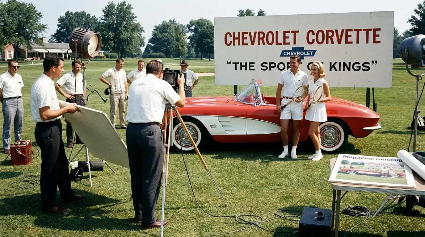
The early version was simple by necessity. The first production Corvettes used an enamel badge rendered in red, white, and blue against chrome. The checkered flag was stylized rather than photorealistic, the proportions leaning formal rather than aggressive. It suited a car that made 150 hp from a six-cylinder engine and was as much a show car concept as a serious performance machine. But it planted a flag, so to speak, on what the Corvette was claiming to be.
If you want read the overview of how the car itself evolved through these decades, the badge changes make a lot more sense against that larger backdrop. The logo and the car moved together.
The V8 era and what it changed for the emblem
The 1955 model year brought the 265 cubic inch V8, and that changed everything about what the Corvette was trying to say. The car finally had the engine that matched its attitude. The badge began shifting too, though the transition was gradual through the late 1950s into the C2 era. By the time the Sting Ray arrived for 1963, the crossed flags had become more refined, more sculpted. The enamel work was precise. The proportions were balanced in a way that felt deliberate rather than improvised.
One thing that often gets overlooked is the flag on the right side of the cross. For most of the car's early history, that flag carried a fleur-de-lis alongside the Chevrolet bowtie, a detail that connected the emblem back to Chevrolet's Franco-American founding mythology. Louis Chevrolet and William Durant. The fleur-de-lis was a quiet reference to that heritage, not especially prominent, but consistent. It stayed through the C2 and into the C3.
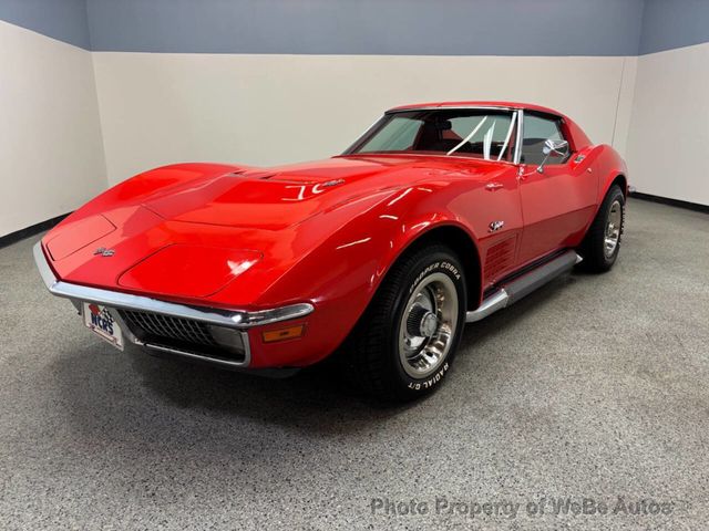
The C3 generation, which ran from 1968 through 1982, is where the crossed flags reached their most dramatic visual expression. The chrome was heavier, the badge larger, the presentation more assertive. This was the era of the Shark body and the Stingray script, and the emblem fit that aesthetic. By the late C3 years, when emissions regulations and the energy crisis had taken the edge off performance numbers, the badge was doing more work than the engine to project a performance image.
The redesigns that actually mattered
The C4 arrived for 1984 and brought a cleaner, more contemporary badge. The fleur-de-lis was dropped with the C4, leaving just the checkered flag and the Chevrolet bowtie. It was a simpler, more legible design, suited to a car that was taking a more modern, squared-off approach to everything from its body lines to its instrument panel.
The 1997 C5 brought the generation of crossed flags that most collectors now associate with the modern car, and it restored the fleur-de-lis that had been absent through the C4's entire run. The badge was redesigned to be flatter, more graphic, almost architectural in the way it presented the two flags at their intersection. It tracked well with the C5's cleaner overall design language. The C6, arriving for 2005, refined it further. The colors sharpened. The proportions were adjusted. But the fundamental geometry held.
The C7 generation (2014-2019) pushed the badge further into abstraction. The crossed flags became more angular, the overall shape more aggressive, fitting a car that topped out with the 650 hp Z06 and the 755 hp ZR1. The C8's mid-engine layout for 2020 brought yet another iteration, this time designed to work on a car with a very different visual personality than anything that came before. The badge moved with the car again, as it has every time.
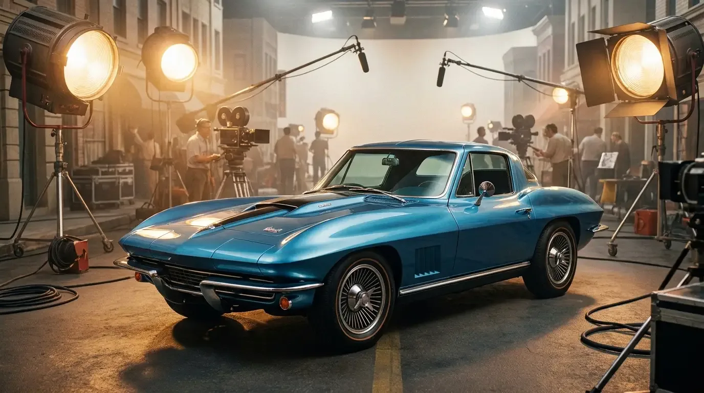
For anyone curious about how the Corvette's image extended beyond the car itself, the deeper story covers the car's broader cultural reach across film and television, where the badge often carried as much meaning as the car beneath it.
What the logo actually tells us about the Corvette project
There is something worth sitting with in the fact that the crossed flags format has never been abandoned. Other manufacturers have gone through complete logo overhauls. The Corvette's designers have always found a way back to the same core idea: two flags crossing at the center, one representing racing, one representing Chevrolet. Every generation has redrawn the execution. None of them have touched the concept.
"The crossed flags have absorbed every styling era the car has been through, from chrome-and-enamel Motorama to mid-engine supercar, and they still read as Corvette. That kind of emblem continuity is rarer than people realize."
— Patrick Walsh
Part of that durability is the simplicity of the underlying idea. Checkered flag equals racing. Chevrolet flag equals origin and brand identity. You don't need to know anything about the car to read the intent. That clarity has made the emblem remarkably portable across body styles, color palettes, and performance eras that have almost nothing else in common with each other.
The companion story about the companion story is useful here: the crossed flags have appeared in Corvette advertising since the 1950s, and the way they've been used over the decades tracks closely with how Chevrolet has wanted the car positioned at any given moment.
Collecting the badge itself
Original Corvette badges, particularly from the C1 and early C2 era, have become collectible in their own right. The condition of the enamel matters. The chrome backing matters. NOS (new old stock) pieces, when they surface, attract serious attention at marque-specific events. Later C3 badges are more available but original examples still carry a premium over reproduction parts.
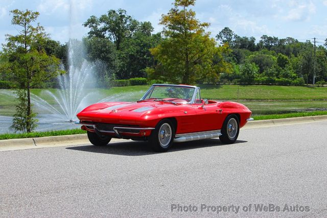
For anyone in the market for a classic Corvette where the badge is part of the authenticity picture, condition and correctness vary considerably by generation and trim level. classic Corvette for sale listings give you a current sense of what's available and how badge and emblem condition factors into asking prices across different generations.
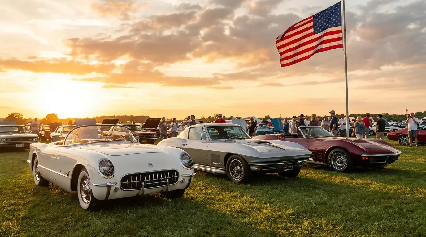
The crossed flags have meant different things at different points in the car's history. In 1953, they were aspirational, a statement of what the car was going to become rather than what it was. By the mid-1960s, they were genuinely earned. Through the soft years of the 1970s, they carried the car's reputation while the hardware caught up with the image. Since the C5, they have been largely redundant in the sense that the car no longer needs the emblem to make its performance case. But that redundancy hasn't diminished them. Seventy-plus years of the same core idea, redrawn by each generation's designers and accepted by each generation of owners. That's an unusual kind of staying power for something as simple as two flags crossing at the center.
Sources and notes
- Capitol City Corvette Club: History of the Corvette Emblem — confirmed the original American flag design was replaced before the 1953 Motorama debut, and the two-flag composition since then
- Corvette Action Center: Emblem History — confirmed the illegal-use-of-American-flag redesign and the Chevrolet/fleur-de-lis replacement flag details
- CarBuzz: Evolution of the Chevrolet Corvette Logo — confirmed fleur-de-lis dropped with C4 (1984) and restored with C5 (1997)
- CorvSport: 1953 Corvette Performance and Specifications — confirmed 150 hp at 4,200 rpm from the 235.5 cu in Blue Flame six-cylinder
- Wikipedia: Chevrolet Corvette C7 — confirmed 2014-2019 generation span, 650 hp Z06, 755 hp ZR1
- GM Authority: Evolution of the Chevrolet Corvette Logo — confirmed generation-by-generation emblem changes through C8